
Fine Tuning with Custom Code
In the first part of this tutorial we went from a GAMSPy model to a first basic GAMS MIRO application for this gallery example. In the second part we got familiar with the Configuration Mode. Nevertheless, sometimes we want to customize our application even more. MIRO supports this via custom code, specifically in R, which allows us to go beyond the standard visualizations.
- Fine Tuning with Custom Code
- Custom Import and Export: Streamlining Your Data Workflow
- Deployment
- Key Takeaways
- Conclusion
- Reference Repository
Custom renderer
We will start by creating a simple renderer that shows the BESS storage level at each hour. Up to this point, we only see how much power is charged or discharged (battery_power). The storage level itself can be computed by taking the cumulative sum of battery_power. In R, this is easily done with cumsum()
.
Note that if your data transformation is a simple function (e.g., a single cumulative sum), you could (and should!) do it directly in Python by creating a new output parameter, eliminating the need for a custom renderer, and directly use the pivot tool again for visualization. Here we use this example mainly to introduce custom renderers in MIRO.
Renderer Structure
First, we need to understand what the general structure of a custom renderer is in MIRO. For this we will closely follow the documentation . MIRO leverages R Shiny under the hood, which follows a two-function approach:
- Placeholder function (server output): Where we specify the UI elements (plots, tables, etc.) and where they will be rendered.
- Rendering function: Where we do the data manipulation, define the reactive logic, and produce the final display.
For more background on Shiny, see R Shiny’s official website .
A typical MIRO custom renderer follows this template (using battery_power as an example):
# Placeholder function must end with "Output"
mirorenderer_<lowercaseSymbolName>Output <- function(id, height = NULL, options = NULL, path = NULL){
  ns <- NS(id)
}

# The actual rendering must be prefixed with the keyword "render"
renderMirorenderer_<lowercaseSymbolName> <- function(input, output, session, data, options = NULL, path = NULL, rendererEnv = NULL, views = NULL, outputScalarsFull = NULL, ...){

}
If you are not using the Configuration Mode, you must save these functions in a file named mirorenderer_<lowercaseSymbolName>.R inside the renderer_<model_name> directory. However, if you are using the Configuration Mode, you can add the custom renderer directly under the Graphs by setting its charting type to Custom renderer. The Configuration Mode will automatically create the folder structure and place your R code in the correct location when you save.

Placeholder Function
The placeholder function creates the UI elements Shiny will render. Shiny requires each element to have a unique ID, managed via the NS()
function, which appends a prefix to avoid naming conflicts.
Here’s how it works in practice:
- Define the prefix function: First, call
NS()with the renderer’s ID to create a function that we will store in a variablens. - Use the prefix function on elements: Whenever you define a new input or output element, prefix its ID with
ns(). This will give each element a unique prefixed ID.
In our first example, we only want to draw a single plot of the BESS storage level. Hence, we define one UI element:
# Placeholder function
mirorenderer_battery_powerOutput <- function(id, height = NULL, options = NULL, path = NULL) {
    ns <- NS(id)
    plotOutput(ns("cumsumPlot"))
}
Note that instead of writing plotOutput("cumsumPlot", ...), we use plotOutput(ns("cumsumPlot"), ...) to ensure that the cumsumPlot is uniquely identified throughout the application.
We only have one plot here, but you can create as many UI elements as you need. To get a better overview what is possible check the R Shiny documentation, e.g. their section on Arrange Elements .
Rendering Function
Next, we implement the actual renderer, which handles data manipulation and visualization. We have defined an output with the output function plotOutput()
. Now we need something to render inside. For this, we assign renderPlot()
to an output object inside the rendering function, which is responsible for generating the plot. Here’s an overview:
- Output functions: These functions determine how the data is displayed, such as
plotOutput(). - Rendering functions: These are functions in Shiny that transform your data into visual elements, such as plots, tables, or maps. For example,
renderPlot()is a reactive plot suitable for assignment to an output slot.
Now we need a connection between our placeholder and the renderer. To do this, we look at the arguments the rendering function gets
input: Access to Shiny inputs, i.e. elements that generate data, such as sliders, text input,… (input$hour).output: Controls elements that visualize data, such as plots, maps, or tables (output$cumsumPlot).session: Contains user-specific information.data: The data for the visualization is specified as an R tibble . If you’ve specified multiple datasets in your MIRO application, the data will be a named list of tibbles. Each element in this list corresponds to a GAMS symbol (data$battery_power).
For more information about the other options, see the documentation .
We will now return to the Configuration Mode and start building our first renderer. Hopefully you have already added plotOutput(ns("cumsumPlot")) to the placeholder function. To get a general idea of what we are working with, let us first take a look at the data by simply printing it (print(data)) inside the renderer. If we now press Update, we still won’t see anything, because no rendering has been done yet, but if we look at the console, we will see:
# A tibble: 24 x 6
   j      level marginal lower upper scale
   <chr>  <dbl>    <dbl> <dbl> <dbl> <dbl>
 1 hour00   -50        0  -Inf   Inf     1
 2 hour01   -80        0  -Inf   Inf     1
 3 hour02   -90        0  -Inf   Inf     1
 4 hour03  -100        0  -Inf   Inf     1
 5 hour04   -30        0  -Inf   Inf     1
 6 hour05   -10        0  -Inf   Inf     1
 7 hour06    10        0  -Inf   Inf     1
 8 hour07    40        0  -Inf   Inf     1
 9 hour08   -40        0  -Inf   Inf     1
10 hour09     0        0  -Inf   Inf     1
# i 14 more rows
Since we have not specified any additional data sets so far, data directly contains the variable battery_power, which is the GAMS symbol we put in the mirorender name. For our plot of the storage levels we now need the values from the level column, which we can access in R with data$level. More on subsetting tibbles can be found here
.
Let’s now finally make our first plot! First we need to calculate the data we want to plot, which we store in storage_level. The values in battery_power are from the city’s perspective; negative means charging the BESS, positive means discharging. We negate the cumulative sum to get the actual storage level. We use the standard R barplot()
for visualization, but any plotting library can be used. Finally, we just need to pass this reactive plot to a render function and assign it to the appropriate output variable. The code should look like this:
storage_level <- -cumsum(data$level)
output$cumsumPlot <- renderPlot({
        barplot(storage_level)
    })
If you press Update again, you should get this:

Now let’s make this graph prettier. Aside from adding a title, labels, etc., take a look at the y-axis. As you can see, it doesn’t go all the way to the top. To change this, we can set it to the maximum value of our data. But what might be more interesting is to see the current storage value compared to the maximum possible. As you may remember, this maximum storage level is also part of our optimization. So now we need to add data from other model symbols to our renderer. First go to Advanced options and then by clicking on Additional datasets to communicate with the custom renderer we will see all the symbols we can add to the renderer. Since we need the data from the scalar variable battery_storage, we add "_scalarsve_out". Going back to the Main tab, we now need to change how we access the data, since data is no longer a single tibble, but a named list of tibbles. In the example below we use filter()
and pull()
to extract the desired data. Note that %>% is the pipe operator, which is used to pass the result of an expression or function as the input to the next function in a sequence, improving the readability and flow of your code.
max_storage <- data[["_scalarsve_out"]] %>%
    filter(scalar == "battery_storage") %>%
    pull(level)
We will use the "battery_storage" for adding a horizontal line with abline()
. Adding some more layout settings leads us to:

Click to see the full code of the renderer
mirorenderer_battery_powerOutput <- function(id, height = NULL, options = NULL, path = NULL) {
    ns <- NS(id)
    plotOutput(ns("cumsumPlot"))
}

renderMirorenderer_battery_power <- function(input, output, session, data, options = NULL, path = NULL, rendererEnv = NULL, views = NULL, outputScalarsFull = NULL, ...) {
    battery_power <- data$battery_power$level
    storage_level <- -cumsum(battery_power)

    max_storage <- data[["_scalarsve_out"]] %>%
        filter(scalar == "battery_storage") %>%
        pull(level)

    output$cumsumPlot <- renderPlot({
        barplot(storage_level,
            col = "lightblue", ylab = "Energy Capacity in kWh",
            names.arg = data$battery_power$j, las = 2,
            main = "Storage level of the BESS"
        )
        grid()
        abline(h = max_storage, col = "red", lwd = 2, lty = 2)
    })
}
By clicking Save, the Configuration Mode generates the file structure and JSON configuration automatically. Again, if you are not using the Configuration Mode, you will need to add this manually. The template can be found in the documentation .
Congratulations you created your first renderer!
Now that we have created our first small custom renderer, we can start working on some more complex renderers.
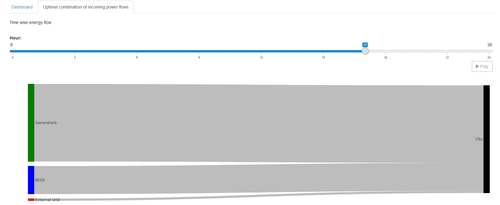
A more complex renderer
We are going to make a simple Sankey diagram for our power flow. We will base this renderer on our report_output variable which contains the three power variables and the load demand. It will show the current power flow at a given hour. To change the hour we will add a slider. This results in the following placeholder function:
mirorenderer_report_outputOutput <- function(id, height = NULL, options = NULL, path = NULL) {
  ns <- NS(id)
  tagList(
    sliderInput(ns("hour"), "Hour:",
      min = 0, max = 23,
      value = 0, step = 1,
    ),
    plotly::plotlyOutput(ns("sankey"), height = "100%")
  )
}
Since we just want both elements on top of each other, we use a tagList()
. First we have our slider, which we give an id, again using the ns() function to prefix it. We set min, max, initial value and stepsize. Second, we have a plot for which we use plotlyOutput()
, since we will be using the plotly library to generate the Sankey plot. Because plotly is not part of MIRO’s core, we must add the package to our environment. This can be done in the same way as the additional data in the Advanced options menu. This also means that we need to specify the package name explicitly using the double colon operator. Again, if you are not using the Configuration Mode, follow the documentation
.
Now that we have some placeholders, we need to fill them. Let us begin to set up our Sankey diagram. First, we need to decide which nodes we need. We will add one for the BESS, the generators, the external grid, and the city. You need to remember the order so that you can assign the links correctly later.
node = list(
        label = c("BESS", "Generators", "External Grid", "City"),
        color = c("blue", "green", "red", "black"),
        pad = 15,
        thickness = 20,
        line = list(
          color = "black",
          width = 0.5
        )
)
With the nodes defined we need to set the links. Each link has a source, a target and a value. The possible sources and targets are defined by our given nodes. We will define lists for all three and fill them based on our data.
link = list(
    source = sankey_source,
    target = sankey_target,
    value =  sankey_value
)
To be able to display the power value of the correct time point we need to get the hour from our slider, which we get from our input parameter.
hour_to_display <- sprintf("hour%02d", input$hour)
Note that we use sprintf()
to get the same string we use to represent the hour in our GAMS symbols, so that we can filter the data for the correct hour.
Here we need to be careful: input is a reactive variable, it automatically updates the diagram when the slider is updated. This means we need to put it in a reactive context. For example, in R you can use observe()
. However, since our rendering depends on only one input and only one output, we keep it simple and place all our calculations inside renderPlotly(). We can do this because rendering functions are also observers. If you want to learn more about R Shiny’s reactive expressions, you can find a more detailed tutorial here
.
With that figured out, we need to extract the correct power values. First we need to select the correct power type, then the current hour and add it to the links if it is not zero. Because GAMS doesn’t store zeros, we need to check if a row exists for each hour-power combination. Here you see how to do it for the battery_power:
battery_to_display <- filter(data, power_output_header == "battery") %>%
  filter(j == hour_to_display)
Click to see the other two power sources
gen_to_display <- filter(data, power_output_header == "generators") %>%
  filter(j == hour_to_display)
extern_to_display <- filter(data, power_output_header == "external_grid") %>%
  filter(j == hour_to_display)
Now that we have our values, we need to add them to our link list. But remember to make sure that the value exists (here using dim()
), and for the BESS we need to keep in mind that we can have positive and negative power flows, either from the city to the BESS or the other way around! Here is a way to add the BESS links:
# go over each source and check if they exist and if so add the corresponding link
if (dim(battery_to_display)[1] != 0) {
  # for the battery need to check if is charged, or discharged
  if (battery_to_display[["value"]] > 0) {
    sankey_source <- c(sankey_source, 0)
    sankey_target <- c(sankey_target, 3)
    sankey_value <- c(sankey_value, battery_to_display[["value"]])
  } else {
    sankey_source <- c(sankey_source, 3)
    sankey_target <- c(sankey_target, 0)
    sankey_value <- c(sankey_value, -battery_to_display[["value"]])
  }
}
Add similar code snippets for the remaining two power sources.
Click to see the other two power sources
if (dim(gen_to_display)[1] != 0) {
  sankey_source <- c(sankey_source, 1)
  sankey_target <- c(sankey_target, 3)
  sankey_value <- c(sankey_value, gen_to_display[["value"]])
}

if (dim(extern_to_display)[1] != 0) {
  sankey_source <- c(sankey_source, 2)
  sankey_target <- c(sankey_target, 3)
  sankey_value <- c(sankey_value, extern_to_display[["value"]])
}
With this, we have all the necessary components to render the Sankey diagram. We add one more small feature. Sliders can be animated quite easily in R Shiny. All you need to do is add an animate option to the sliderInput() function:
animate = animationOptions(
        interval = 1000, loop = FALSE,
        playButton = actionButton("play", "Play", icon = icon("play"), style = "margin-top: 10px;"),
        pauseButton = actionButton("pause", "Pause", icon = icon("pause"), style = "margin-top: 10px;")
      )
Now we can inspect the hourly power flow between generators, the external grid, BESS, and the city. The slider animates this flow over time.
Click to see the code of the full renderer
mirorenderer_report_outputOutput <- function(id, height = NULL, options = NULL, path = NULL) {
  ns <- NS(id)
  tagList(
    sliderInput(ns("hour"), "Hour:",
      min = 0, max = 23,
      value = 0, step = 1,
      animate = animationOptions(
        interval = 1000, loop = FALSE,
        playButton = actionButton("play", "Play", icon = icon("play"), style = "margin-top: 10px;"),
        pauseButton = actionButton("pause", "Pause", icon = icon("pause"), style = "margin-top: 10px;")
      )
    ),
    # since plotly is a custom package, it is not attached by MIRO to avoid name collisions
    # Thus, we have to prefix functions exported by plotly via the "double colon operator":
    # plotly::renderPlotly
    plotly::plotlyOutput(ns("sankey"), height = "100%")
  )
}

renderMirorenderer_report_output <- function(input, output, session, data, options = NULL, path = NULL, rendererEnv = NULL, views = NULL, outputScalarsFull = NULL, ...) {
  # since renderPlotly (or any other render function) is also an observer we are already in an reactive context
  output$sankey <- plotly::renderPlotly({
    hour_to_display <- sprintf("hour%02d", input$hour)

    # start with empty lists for the sankey links
    sankey_source <- list()
    sankey_target <- list()
    sankey_value <- list()

    # since the GAMS output is melted, first need to extract the different power sources
    battery_to_display <- filter(data, power_output_header == "battery") %>%
      filter(j == hour_to_display)
    gen_to_display <- filter(data, power_output_header == "generators") %>%
      filter(j == hour_to_display)
    extern_to_display <- filter(data, power_output_header == "external_grid") %>%
      filter(j == hour_to_display)

    # go over each source and check if they exist and if so add the corresponding link
    if (dim(battery_to_display)[1] != 0) {
      # for the battery need to check if is charged, or discharged
      if (battery_to_display[["value"]] > 0) {
        sankey_source <- c(sankey_source, 0)
        sankey_target <- c(sankey_target, 3)
        sankey_value <- c(sankey_value, battery_to_display[["value"]])
      } else {
        sankey_source <- c(sankey_source, 3)
        sankey_target <- c(sankey_target, 0)
        sankey_value <- c(sankey_value, -battery_to_display[["value"]])
      }
    }

    if (dim(gen_to_display)[1] != 0) {
      sankey_source <- c(sankey_source, 1)
      sankey_target <- c(sankey_target, 3)
      sankey_value <- c(sankey_value, gen_to_display[["value"]])
    }

    if (dim(extern_to_display)[1] != 0) {
      sankey_source <- c(sankey_source, 2)
      sankey_target <- c(sankey_target, 3)
      sankey_value <- c(sankey_value, extern_to_display[["value"]])
    }

    # finally generate the sankey diagram using plotly
    plotly::plot_ly(
      type = "sankey",
      orientation = "h",
      node = list(
        label = c("BESS", "Generators", "External Grid", "City"),
        color = c("blue", "green", "red", "black"),
        pad = 15,
        thickness = 20,
        line = list(
          color = "black",
          width = 0.5
        )
      ),
      link = list(
        source = sankey_source,
        target = sankey_target,
        value =  sankey_value
      )
    )
  })
}

Hopefully you now have a better idea of what is possible with custom renderers and how to easily use the Configuration Mode to implement them.
Custom Dashboard
Now that we know so much more about custom renderers, let us embed custom code in our dashboard . We will add the simple renderer for the storage level of the BESS. We follow the documentation closely for this. To add custom code to the renderer, we no longer just use json, but we use the dashboard as a custom renderer. The dashboard renderer has been prepared to do this with minimal effort.
-
Download the latest dashboard renderer file from the GAMS MIRO repository on GitHub and put it with the other renderers in your renderer_<model_name> directory.
-
In the dashboard.R file, make the following changes:
- dashboardOutput <- function(id, height = NULL, options = NULL, path = NULL) {
+ mirorenderer__scalarsve_outOutput <- function(id, height = NULL, options = NULL, path = NULL) {
    ns <- NS(id)
    ...
  }
- renderDashboard <- function(id, data, options = NULL, path = NULL, rendererEnv = NULL, views = NULL, outputScalarsFull = NULL, ...) {
+ renderMirorenderer__scalarsve_out <- function(input, output, session, data, options = NULL, path = NULL, rendererEnv = NULL, views = NULL, outputScalarsFull = NULL, ...) {
-   moduleServer(
-     id,
-     function(input, output, session) {
        ns <- session$ns
        ...

# These are the last three lines of code in the file
- }
-)
}
Remember that the dashboard is rendered for the symbol "_scalarsve_out". As with the other renderers, be sure to replace it with the symbol name you want to render if you create a dashboard for a different symbol.
- In the
dataRenderingsection of the <model_name>.json file change the"outType"of the symbol to render from"dashboard"to"mirorenderer_<symbolname>"
  {
   "dataRendering": {
     "_scalarsve_out": {
-      "outType": "dashboard",
+      "outType": "mirorenderer__scalarsve_out",
       "additionalData": [...],
       "options": {...}
     }
   }
 }
Now you can restart the application and have the same renderer as before, only now we can extend it with custom code!
To add custom code, we first need to decide where to put it. Here we will add it as a second element to the battery_power view. Note that the given title will be ignored by the custom code, so we will leave it empty.
"dataViews": {
  "battery_power": [
    {"BatteryTimeline": "Charge/Discharge of the BESS"},
    {"BatteryStorage": ""}
  ],
  ...
}
In the corresponding "dataViewsConfig" section we now assign an arbitrary string, e.g. "BatteryStorage": "customCode", instead of a view configuration as before:
"dataViewsConfig": {
  "BatteryStorage": "customCode",
  ...
}
Finally, we can add the custom code. Recall that in our custom renderers, we always defined placeholders with unique IDs that were then assembled into the output variable. The view ID we just added ("BatteryStorage") will also be added to the output variable. Now we just add our already implemented renderer to the render function (renderMirorenderer__scalarsve_out). The only thing we have to change is the output to which we assign the plot: output[["BatteryStorage"]] <- renderUI(...). And remember that we are no longer in our renderer for the symbol battery_power, so battery_power is now additional data that we access with data$battery_power. However, since we have already added additional data to the renderer before, the code does not change. Just keep in mind that if the renderer you’re adding didn’t have additional data before, you’ll have to change how you access the data! To keep track, we add the new output assignment at the end of the dashboard renderer, but as long as it’s inside the renderer, the order doesn’t matter.
renderMirorenderer__scalarsve_out <- function(input, output, session, data, options = NULL, path = NULL, rendererEnv = NULL, views = NULL, outputScalarsFull = NULL, ...) {

  ...

  battery_power <- data$battery_power$level
  storage_level <- -cumsum(battery_power)

  max_storage <- data[["_scalarsve_out"]] %>%
    filter(scalar == "battery_storage") %>%
    pull(level)

  # corresponding to the dataView "BatteryStorage"
  output[["BatteryStorage"]] <- renderUI({
    tagList(
      renderPlot({
        barplot(storage_level,
          col = "lightblue", ylab = "Energy Capacity in kWh",
          names.arg = data$battery_power$j, las = 2,
          main = "Storage level of the BESS"
        )
        grid()
      })
    )
  })
}
In the same way, you can create a view that’s entirely made up of custom code or include as many custom code elements as you like.
Dashboard Comparison with Custom Code
You can also introduce custom renders to the dashboard comparison. Since this is quite similar to what we just did, we won’t go over it again here. If you want to include the custom renderer, simply follow the documentation . Just note that you cannot directly copy your old custom renderer; you’ll need to adapt it to the new data structure, which now includes the scenario dimension!
Custom Widget
Let’s take a closer look at another aspect of MIRO customization - creating a custom widget. Until now, our custom renderers have been for data visualization only. But for input symbols, we can also use custom code that allows you to produce input data that is sent to your model. This means that the input data for your GAMS(Py) model can be generated by interactively modifying a chart, table or other type of renderer.
In MIRO, each symbol tab provides both a tabular and a graphical data representation by default. If you have a custom renderer for an input symbol, you would typically switch to the graphical view to see it. However, modifying the actual data to be sent to the model requires using the tabular view. In the following example, we will write a custom input widget that replaces the default tabular view for an input symbol. Since we have complete control over what to display in this custom widget, we can include an editable table for data manipulation as well as a visualization that updates whenever the table data changes - providing a more seamless and interactive way to prepare input for your model.
Currently, the Configuration Mode does not offer direct support for implementing custom input widgets, but we can create them the same way we create a custom renderer and then make a few changes to convert it into a widget.
First, we develop a placeholder function that displays both a plot and a data table. For the table we will use R Shinys DataTables
. To do this, you must first add DT
to the additional packages and prefix the corresponding functions in the code. To define the output we use DT:DTOutput()
:
mirorenderer_timewise_load_demand_and_cost_external_grid_dataOutput <- function(id, height = NULL, options = NULL, path = NULL){
  ns <- NS(id)
  fluidRow(
    column(width = 12, plotOutput(ns("timeline"))),
    column(width = 12, DT::DTOutput(ns("table")))
  )
}
Before we make it interactive, let’s fill in our placeholders. For the table, we assign it with DT:renderDT()
, where we define the DT:datatable()
and we will round our cost values with DT:formatRound()
:
output$table <- DT::renderDT({
  DT::datatable(data, editable = TRUE, rownames = FALSE, options = list(scrollX = TRUE)) %>%
    DT::formatRound(c("cost_external_grid"), digits = 2L)
})
Here, editable = TRUE is crucial - it allows users to modify the table entries. For the plot, we need something like this:
output$timeline <- renderPlot({
  ...
})
We have two variables measured in different units (load_demand in W and cost_external_grid in $), and we want to display them on the same plot. Take a look at the remaining code to see how it might be structured. One approach is to use par()
and axis()
to overlay two y-axes.
Click to see the code
renderMirorenderer_timewise_load_demand_and_cost_external_grid_data <- function(input, output, session, data, options = NULL, path = NULL, rendererEnv = NULL, views = NULL, outputScalarsFull = NULL, ...){
  # return the render for the placeholder "table"
  output$table <- DT::renderDT({
    DT::datatable(data, editable = TRUE, rownames = FALSE, options = list(scrollX = TRUE)) %>%
      DT::formatRound(c("cost_external_grid"), digits = 2L)
  })

  # return the render for the placeholder "timeline"
  output$timeline <- renderPlot({
    # first extract all the needed information
    x <- data[["j"]]
    y1 <- data[["load_demand"]]
    y2 <- data[["cost_external_grid"]]

    # set the margin for the graph
    par(mar = c(5, 4, 4, 5))

    # first, plot the load demand
    plot(y1,
      type = "l", col = "green",
      ylab = "Load demand in W", lwd = 3, xlab = "", xaxt = "n", las = 2
    )
    points(y1, col = "green", pch = 16, cex = 1.5)
    grid()

    # add second plot on the same graph for the external cost
    par(new = TRUE) # overlay a new plot
    plot(y2,
      type = "l", col = "blue",
      axes = FALSE, xlab = "", ylab = "", lwd = 3
    )
    points(y2, col = "blue", pch = 16, cex = 1.5)

    # add a new y-axis on the right for the second line
    axis(side = 4, las = 2)
    mtext("External grid cost in $", side = 4, line = 3)
    grid()

    # add the x values to the axis
    axis(side = 1, at = 1:length(x), labels = x, las = 2)

    legend("topleft",
      legend = c("Load demand", "External grid cost"),
      col = c("green", "blue"), lty = 1, lwd = 2, pch = 16
    )
  })
}
Now you should see something like this:

At this point, any changes we make in the table do not reflect in the plot. To fix this, we need reactive expressions . We need to add them for each interaction that should result in an update.
First, we define a variable rv for our reactiveValues
.
rv <- reactiveValues(
  timewise_input_data = NULL
)
To set rv$timewise_input_data we observe()
the initial data. If it changes we set our reactive value to the data.
observe({
  rv$timewise_input_data <- data
})
To monitor edits to the table, we define a new observe() that will be triggered when input$table_cell_edit changes. We get the row and column index of the edited cell (input$table_cell_edit$row and input$table_cell_edit$col) and update the corresponding value in rv$timewise_input_data. The isolate()
function ensures that changes to rv do not trigger this observe() function.
# observe if the table is edited
observe({
  input$table_cell_edit

  row <- input$table_cell_edit$row
  # need to add one since the first column is the index
  clmn <- input$table_cell_edit$col + 1

  isolate({
    rv$timewise_input_data[row, clmn] <- input$table_cell_edit$value
  })
})
If the new value of the entry would be empty (""), we want to reset the table. To do this, we set up a dataTableProxy()
to efficiently update the table. Our resetTable() function is defined to dynamically replace the table data using the current state of rv$timewise_input_data. The function DT::replaceData()
allows the table to be updated without resetting sorting, filtering, and pagination. We need to isolate() the data again so that the function is not called if rv changes!
tableProxy <- DT::dataTableProxy("table")

resetTable <- function() {
  DT::replaceData(tableProxy, isolate(rv$timewise_input_data), resetPaging = FALSE, rownames = FALSE)
}
Finally, we now need to reference rv$timewise_input_data instead of data in the plot renderer, so that the plot is updated whenever a table cell changes.
Click to see the full code of the current state
renderMirowidget_timewise_load_demand_and_cost_external_grid_data <- function(input, output, session, data, options = NULL, path = NULL, rendererEnv = NULL, views = NULL, outputScalarsFull = NULL, ...) {
  # The whole code is run at the beginning, even though no actions are performed yet.
  # init is used to only perform action in observe() after this initial run.
  # Therefore, it is set to TRUE in the last occurring observe()
  init <- FALSE
  rv <- reactiveValues(
    timewise_input_data = NULL
  )

  # set the initial data
  observe({
    rv$timewise_input_data <- data
  })

  tableProxy <- DT::dataTableProxy("table")

  resetTable <- function() {
    DT::replaceData(tableProxy, isolate(rv$timewise_input_data), resetPaging = FALSE, rownames = FALSE)
  }

  # observe if the table is edited
  observe({
    input$table_cell_edit
    row <- input$table_cell_edit$row
    # need to add one since the first column is the index
    clmn <- input$table_cell_edit$col + 1

    # if the new value is empty, restore the value from before
    if (input$table_cell_edit$value == "") {
      resetTable()
      return()
    }

    # else, update the corresponding value in the reactiveValue
    isolate({
      rv$timewise_input_data[row, clmn] <- input$table_cell_edit$value
    })
  })

  # return the render for the placeholder "table"
  output$table <- DT::renderDT({
    DT::datatable(rv$timewise_input_data, editable = TRUE, rownames = FALSE, options = list(scrollX = TRUE)) %>%
      DT::formatRound(c("cost_external_grid"), digits = 2L)
  })

  # return the render for the placeholder "timeline"
  output$timeline <- renderPlot({
    # first extract all the needed information
    x <- rv$timewise_input_data[["j"]]
    y1 <- rv$timewise_input_data[["load_demand"]]
    y2 <- rv$timewise_input_data[["cost_external_grid"]]

    # set the margin for the graph
    par(mar = c(5, 4, 4, 5))

    # first, plot the load demand
    plot(y1,
      type = "l", col = "green",
      ylab = "Load demand in W", lwd = 3, xlab = "", xaxt = "n", las = 2
    )
    points(y1, col = "green", pch = 16, cex = 1.5)
    grid()

    # add second plot on the same graph for the external cost
    par(new = TRUE) # overlay a new plot
    plot(y2,
      type = "l", col = "blue",
      axes = FALSE, xlab = "", ylab = "", lwd = 3
    )
    points(y2, col = "blue", pch = 16, cex = 1.5)

    # add a new y-axis on the right for the second line
    axis(side = 4, las = 2)
    mtext("External grid cost in $", side = 4, line = 3)
    grid()

    # add the x values to the axis
    axis(side = 1, at = 1:length(x), labels = x, las = 2)

    legend("topleft",
      legend = c("Load demand", "External grid cost"),
      col = c("green", "blue"), lty = 1, lwd = 2, pch = 16
    )
  })
}
After these changes, we have a reactive table-plot combination, but it still behaves like an output renderer. We need to take a few final steps to turn this into a custom input widget so that the new data can be used to solve!
From Custom Renderer To Custom Widget
To turn the renderer into a widget, we save our renderer in the Configuration Mode and go to the directory where it was saved. Here we first need to change the name of the file to “mirowidget_timewise_load_demand_and_cost_external_grid_data.R” Now we need to rename the functions:
- mirorenderer_timewise_load_demand_and_cost_external_grid_dataOutput <- function(id, height = NULL, options = NULL, path = NULL){
+ mirowidget_timewise_load_demand_and_cost_external_grid_dataOutput <- function(id, height = NULL, options = NULL, path = NULL) {
  ...
}

- renderMirorenderer_timewise_load_demand_and_cost_external_grid_data <- function(input, output, session, data, options = NULL, path = NULL, rendererEnv = NULL, views = NULL, outputScalarsFull = NULL, ...){
+ renderMirowidget_timewise_load_demand_and_cost_external_grid_data <- function(input, output, session, data, options = NULL, path = NULL, rendererEnv = NULL, views = NULL, outputScalarsFull = NULL, ...) {
  ...
}
We need to make some small changes to our code. The data parameter is no longer a tibble, but a reactive expression
(data()). Therefore, we need to call it to retrieve the current tibble with our input data. Whenever the data changes (for example, because the user uploaded a new CSV file), the reactive expression is triggered, which in turn causes our table to be re-rendered with the new data.
# set the initial data
observe({
-  rv$timewise_input_data <- data
+ rv$timewise_input_data <- data()
})
All code is executed when the application is started, even though no actions have been performed yet. The init is used to execute actions in observe() only after this initial execution. It ensures that the reactive logic is not executed until the application is fully initialized and all data is loaded. Since we only have one observe() we set it to True here, if we had more we would set init to True in the last observe() block.
  if (!init) {
    init <<- TRUE
    return()
  }
Now, we need to return the input data to be passed to GAMS(Py). For this, we provide a reactive()
wrapper around rv$timewise_input_data. It ensures that the current state of the data is available as a reactive output, allowing us to pass the new data to the model. Otherwise Solve model would still use the old data!
return(reactive({
  rv$timewise_input_data
}))
Click to see the full code
renderMirowidget_timewise_load_demand_and_cost_external_grid_data <- function(input, output, session, data, options = NULL, path = NULL, rendererEnv = NULL, views = NULL, outputScalarsFull = NULL, ...) {
  # The whole code is run at the beginning, even though no actions are performed yet.
  # init is used to only perform action in observe() after this initial run.
  # Therefore, it is set to TRUE in the last occurring observe()
  init <- FALSE
  rv <- reactiveValues(
    timewise_input_data = NULL
  )

  # set the initial data
  observe({
    rv$timewise_input_data <- data()
  })

  tableProxy <- DT::dataTableProxy("table")

  resetTable <- function() {
    DT::replaceData(tableProxy, isolate(rv$timewise_input_data), resetPaging = FALSE, rownames = FALSE)
  }

  # observe if the table is edited
  observe({
    input$table_cell_edit
    if (!init) {
      init <<- TRUE
      return()
    }
    row <- input$table_cell_edit$row
    # need to add one since the first column is the index
    clmn <- input$table_cell_edit$col + 1

    # if the new value is empty, restore the value from before
    if (input$table_cell_edit$value == "") {
      resetTable()
      return()
    }

    # else, update the corresponding value in the reactiveValue
    isolate({
      rv$timewise_input_data[row, clmn] <- input$table_cell_edit$value
    })
  })

  # return the render for the placeholder "table"
  output$table <- DT::renderDT({
    DT::datatable(rv$timewise_input_data, editable = TRUE, rownames = FALSE, options = list(scrollX = TRUE)) %>%
      DT::formatRound(c("cost_external_grid"), digits = 2L)
  })

  # return the render for the placeholder "timeline"
  output$timeline <- renderPlot({
    # first extract all the needed information
    x <- rv$timewise_input_data[["j"]]
    y1 <- rv$timewise_input_data[["load_demand"]]
    y2 <- rv$timewise_input_data[["cost_external_grid"]]

    # set the margin for the graph
    par(mar = c(5, 4, 4, 5))

    # first, plot the load demand
    plot(y1,
      type = "l", col = "green",
      ylab = "Load demand in W", lwd = 3, xlab = "", xaxt = "n", las = 2
    )
    points(y1, col = "green", pch = 16, cex = 1.5)
    grid()

    # add second plot on the same graph for the external cost
    par(new = TRUE) # overlay a new plot
    plot(y2,
      type = "l", col = "blue",
      axes = FALSE, xlab = "", ylab = "", lwd = 3
    )
    points(y2, col = "blue", pch = 16, cex = 1.5)

    # add a new y-axis on the right for the second line
    axis(side = 4, las = 2)
    mtext("External grid cost in $", side = 4, line = 3)
    grid()

    # add the x values to the axis
    axis(side = 1, at = 1:length(x), labels = x, las = 2)

    legend("topleft",
      legend = c("Load demand", "External grid cost"),
      col = c("green", "blue"), lty = 1, lwd = 2, pch = 16
    )
  })

  # since this is an input, need to return the final data
  return(reactive({
    rv$timewise_input_data
  }))
}
Finally, we need to remove the renderer in <model_name>.json and instead add "timewise_load_demand_and_cost_external_grid_data" to the "inputWidgets":
"inputWidgets": {
  ...

  "timewise_load_demand_and_cost_external_grid_data": {
    "alias": "Timeline for load demand and cost of the external grid",
    "apiVersion": 2,
    "options": {
        "isInput": true
    },
    "rendererName": "mirowidget_timewise_load_demand_and_cost_external_grid_data",
    "widgetType": "custom"
  }
}
Congratulations - our new custom widget combines a table and a plot, with both updating interactively. At this point, Solve model will use our updated table whenever we change values and re-run the model.
Now that you’ve mastered the basics of custom renderers in MIRO, you can explore more creative implementations. If you need more inspiration on what you can do with the custom renderer, take a look at the MIRO gallery , e.g. take a look at some applications with maps (TSP or VRPTW ).
Custom Import and Export: Streamlining Your Data Workflow
In any data-centric project, the ability to efficiently manage data movement is critical. While MIRO already provides a number of ways to import and export data - such as GDX, Excel, or CSV - there are many situations where you need more flexible solutions. For instance:
- You might store data in a database and prefer not to export it to CSV first.
- You may gather data from multiple sources and need to reformat it so MIRO recognizes the correct symbol names.
Custom import and export functions handle these scenarios by allowing you to:
- Work directly with databases or other file types.
- Perform pre- or post-processing steps within MIRO.
Custom Importer
Here, we will go over the basic concept to give you a good starting point for extending it to your needs. Again, we follow the documentation closely. First, let’s create a simple import function that gets the data for our generators. For ease of setup, we will just pretend to access a database and actually hardcode the data here.
For our custom importer, we need to create a new file in the renderer_<model_name> directory called miroimport.R. Here you can add several import functions, which should have the following signature:
miroimport_<importerName> <- function(symNames, localFile = NULL, views = NULL, attachments = NULL, metadata = NULL, customRendererDir = NULL, ...) {

}
Here we will only go over the parameters we will be using, for information on the others see the documentation
. The "symNames" parameter is a character vector that specifies the names of the symbols for which data is to be retrieved. There is also an optional "localFile" parameter, which is a data frame containing one row for each uploaded file. What kind of data you can upload here is specified in <model_name>.json.
We also need to add the importer to the <model_name>.json, to do this we simply add a new key "customDataImport":
"customDataImport": [
  {
    "label": "Gen specs import",
    "functionName": "miroimport_<importerName>",
    "symNames": ["generator_specifications"]
  }
]
Where we simply specify the "label" the importer will have when you select it under Load data in the MIRO application. "functionName" specifies the name of our custom import function in miroimport.R. And "symNames" specifying which GAMS symbols the importer handles.
If you want to allow the user to upload files, you need to add "localFileInput", which could look like this
"customDataImport": [
  {
    ...
    "localFileInput": {
      "label": "Please upload your JSON file here",
      "multiple": false,
      "accept": [".json", "application/json"]
    }
  }
]
For more information on the available options, see the documentation .
Now we can start our MIRO application and use the importer, but since we haven’t filled it with code yet, nothing happens. So let’s define miroimport_GenSpecs() to return a tibble with new generator specifications. This is done by returning a named list where the names correspond to the given "symbolNames". Here we will simply hardcode it to return the same data as before, just changing the names to see that it actually imported the new data.
miroimport_GenSpecs <- function(symbolNames, localFile = NULL, views = NULL, attachments = NULL, metadata = NULL, customRendererDir = NULL, ...) {
    # Let's say this is your result
    generator_specifications <- tibble(
        i = c("gen3", "gen4", "gen5"),
        cost_per_unit = c(1.1, 1.3, 0.9),
        fixed_cost = c(220, 290, 200),
        min_power_output = c(50, 80, 10),
        max_power_output = c(100, 190, 70),
        min_up_time = c(4, 4, 4),
        min_down_time = c(2, 2, 2)
    )

    # Now all you need to do is save the import symbols to a named list.
    import_data <- list("generator_specifications" = generator_specifications)

    # And return the data to the MIRO application.
    return(import_data)
}
After saving, we can reload MIRO and select Gen specs import under Load data. The generator names will update accordingly, proving our custom code works. Although this example is hardcoded, the same framework can fetch data from any source, fix column names to fit MIRO’s symbols (stored in "symbolNames"), or perform more complicated transformations such as database queries.
In a real scenario with database queries, you’ll likely store credentials in a secure environment. MIRO allows you to specify environments; this is where we store our credentials. For MIRO Desktop , create a JSON file - e.g., miro-env.js - that looks like:
{
    "DB_USERNAME": "User1",
    "DB_PASSWORD": "mySuperSecretPassword!"
}
Now in MIRO Desktop go to File and then to Preferences. Under Environment you can now upload the json file. You can access these credentials via Sys.getenv() inside your importer, for example:
miroimport_GenSpecs <- function(symbolNames, localFile = NULL, views = NULL, attachments = NULL, metadata = NULL, customRendererDir = NULL, ...) {

    # Where you get your data from depends on your data structures.
    # Let's say we have a MySQL database that contains our generator specifications.
    # To gain access, we store our credentials in the environment.

    # Establish connection
    con <- dbConnect(
        RMySQL::MySQL(),
        dbname = "your_database_name",
        host = "your_host_address",
        port = 3306,
        user = Sys.getenv("DB_USERNAME"),
        password = Sys.getenv("DB_PASSWORD")
    )

    # Run a SQL query and fetch data into a data frame
    query_result <- dbGetQuery(con, "SELECT * FROM generator_specifications")

    # Now all you need to do is save the import symbols to a named list.
    import_data <- list("generator_specifications" = query_result)

    # And return the data to the MIRO application.
    return(import_data)
}
In the documentation you can find an example that also handles file uploads.
By now, you should be well-equipped to write your own custom importer that handles all the data collection and preprocessing your application requires.
Custom Exporter
A custom exporter works similarly. We need to add a miroexport.R to the renderer_<model_name> directory first, which should have the following signature:
miroexport_<exporterName> <- function(data, path = NULL, views = NULL, attachments = NULL, metadata = NULL, customRendererDir = NULL, ...) {

}
Where "data" is again a named list of tibbles containing all input and output symbols of the model and "path" is the path to the (temporary) file provided to the user for download (optional). This depends on how you specified it in the json file:
{
  "customDataExport": [
    {
      "label": "Custom report export",
      "functionName": "miroexport_Markdown",
      "localFileOutput": {
        "filename": "report.md",
        "contentType": "application/md"
      }
    }
  ]
}
Again, we need to link the "functionName", and if we want to create an output file, we need to specify it in "localFileOutput". Here, we’ve chosen to generate a markdown file.
Inside miroexport_Markdown(), we do whatever tasks we want, such as:
- Writing data back to a database (even the input data, since it may have changed due to the interactive nature of the application).
- Generating a downloadable file.
- Merging input parameters with output results in a custom format.
Below is an example that writes a small Markdown report. Helpful functions in this case are "writeLines()"
, "paste()"
, "filter()"
, "pull()"
, "apply()"
…
Your result could look something like this:
Our final total cost is: 26635 $
With a battery power (delivery) rate of 130 kW and a battery energy (storage) rate of 420 kWh.
With the following generator specifications:
| i | cost_per_unit | fixed_cost | min_power_output | max_power_output | min_up_time | min_down_time |
|---|---|---|---|---|---|---|
| gen0 | 1.1 | 220 | 50 | 100 | 4 | 2 |
| gen1 | 1.3 | 290 | 80 | 190 | 4 | 2 |
| gen2 | 0.9 | 200 | 10 | 70 | 4 | 2 |
Click to see the code for the custom exporter
miroexport_Markdown <- function(data, path = NULL, views = NULL, attachments = NULL, metadata = NULL, customRendererDir = NULL, ...) {
    # First, extract the values you want to display.
    total_cost <- data[["_scalars_out"]] %>%
        filter(scalar == "total_cost") %>%
        pull(value) %>%
        as.numeric() %>%
        round(2)

    battery_delivery_rate <- data[["_scalarsve_out"]] %>%
        filter(scalar == "battery_delivery_rate") %>%
        pull(level)

    battery_storage <- data[["_scalarsve_out"]] %>%
        filter(scalar == "battery_storage") %>%
        pull(level)

    output_string <- paste(
        "Our final total cost is: ", total_cost,
        "$\n\nWith a battery power (delivery) rate of ", battery_delivery_rate,
        "kW and a battery energy (storage) rate of ", battery_storage, "kWh."
    )

    # Open a connection to the output file
    file_conn <- file(path, "w")

    # Then write them to the output file.
    writeLines(output_string, file_conn)

    writeLines("\n\n", file_conn)

    # Let's add the generator specifications used
    writeLines("With the following generator specifications:\n\n", file_conn)

    # Extract the table
    table <- data[["generator_specifications"]]

    # Convert the table to a Markdown-style string
    # Create the header
    headers <- paste(names(table), collapse = " | ")
    separator <- paste(rep("---", length(table)), collapse = " | ")
    rows <- apply(table, 1, function(row) paste(row, collapse = " | "))

    # Write the table to the file
    writeLines(paste(headers, separator, paste(rows, collapse = "\n"), sep = "\n"), file_conn)

    # Close the file connection
    close(file_conn)

    # If you also want to save the data to a database,
    # you can do that here as well, similar to the import function.
}
If your exporter uploads results back to a database, you can again use environment variables for credentials, just like in the importer.
Deployment
As a very last step, you will probably want to deploy your new shiny MIRO application. Covering deployment in detail would go beyond the scope of this tutorial, so we encourage you to read the documentation: Deployment . And when you are add it also check out GAMS MIRO Server if you are interested in running MIRO in the cloud.
Key Takeaways
- Unlimited Customization: R-based renderers let you do anything from advanced plotting to building interactive features.
- Leverage Shiny Ecosystem: Shiny’s reactive expressions help you link user actions (sliders, clicks) with real-time graph updates.
- GAMS(Py) for Logic, R for Visuals: Use Python or GAMS to handle calculations; R custom renderers are perfect for specialized visual displays.
- Flexible Format Support: Whether CSV, Excel, JSON, or SQL queries, custom scripts can unify multiple sources or produce tailored outputs.
- Direct Database Access: Skip manual file conversions by pulling/pushing data straight to and from external DBs.
- Pre/Post Processing: Clean or transform your data automatically before it even reaches MIRO or after results are generated.
Conclusion
Throughout this tutorial, we have seen how MIRO empowers you to develop powerful, interactive optimization applications - from rapidly prototyping inputs and outputs to creating intuitive dashboards. We began by defining basic inputs and outputs, then explored how to use the Configuration Mode to effortlessly refine the user interface and data visualization. Going further, we looked at custom renderers to integrate additional functionality or visualization libraries in R Shiny, and even created a custom widget to give users instant feedback on their input changes.
Finally, we addressed the importance of integrating MIRO within larger data ecosystems. By using custom import and custom export functions, you can directly connect to databases, perform preprocessing or postprocessing, and generate tailored output reports. With these tools at hand, MIRO is not merely an optimization front-end but a flexible, end-to-end platform for building and deploying sophisticated data-driven applications.
Use these examples as a starting point for your own projects, adapting each feature - Configuration Mode, custom renderers, widgets, importers, and exporters - to suit your organization’s needs. By taking advantage of MIRO’s extensibility, you can streamline data workflows, create intuitive dashboards, and deliver robust analytical models to users across your organization.
Reference Repository
If you’d like to see a fully operational version of this tutorial in action, head over to our Repository . It contains:
- A self-contained folder with the GAMSPy model setup
- JSON configuration files for MIRO customization
- Example R scripts for custom renderers, widgets, and data import/export
Feel free to clone or fork the repo, adapt it for your organization’s workflows, and submit improvements via pull requests!