
Configuration Mode
In the last part we went from a GAMSPy model to a first basic GAMS MIRO application for this gallery example. Now that we have a better understanding of our model and are confident that it satisfies the given constraints while providing a reasonable solution, we can begin to configure our application.
To do this, we will start our MIRO application in Configuration Mode .
gamspy run miro --mode="config" --path <path_to_your_MIRO_installation> --model <path_to_your_model>
You should see the following:

The Configuration Mode gives us access to a wealth of out-of-the-box customization options, so we don’t need to write any code for now.
General Settings
Let’s start by adjusting some general settings. We can give our application a title, add a logo, include a README, and enable loading the default scenario at startup. These are just a few of the available options. If your company has a specific CSS style, you could include it here as well. For the complete list of settings, see the General settings documentation.
Symbols
Next, we move to the Symbols section. First, we change our symbol aliases to something more intuitive. Then, assuming we might want to tweak scalar inputs often, we change the order in which the input symbols appear. Finally, in some cases, we need to mark variables or parameters as outputs only so we can use them in a custom renderer (we’ll introduce custom renderers in the next part). If such outputs are solely for backend use, we might hide them to avoid cluttering the output section.

Tables
In the Tables section, we can customize the general configuration of input and output tables. In our example, this is optional - our current settings work well enough.
Input Widgets
Input widgets are all items that communicate input data with the model. We have several inputs and we will customize them in the Input Widgets section. Let’s take a look at our scalar inputs first. We can choose between sliders, drop down menus, checkboxes, or numeric inputs. Here, we’ll set them to sliders. If we don’t want to impose any restrictions on the value (minimum, maximum and increment), we would stay with numeric inputs. The best choice depends on the nature of the input data.

For our multidimensional inputs, tables are the only direct option in Configuration Mode. We can pick from three table types. Because our current datasets are relatively small and we don’t plan significant editing, we’ll stick with the default table. If we anticipate working with massive datasets, switching to the performance-optimized Big Data Table is wise. If you know you will be doing a lot of data slicing in your table, you should choose the Pivot Table. For more details on table types, see the documentation .
If these three table types aren’t sufficient for your needs, you can build a custom widget - a process we’ll see in the next part.
Graphs
Finally, let’s explore the Graphs . This is where we can experiment with data visualization. For every multidimensional symbol (input or output), we can define a default visualization. We can choose from the most common plot types or use the Pivot Table again, which we used during rapid prototyping. If we’ve already created useful views, we can now set them as defaults so that anyone opening the application immediately sees the relevant charts.
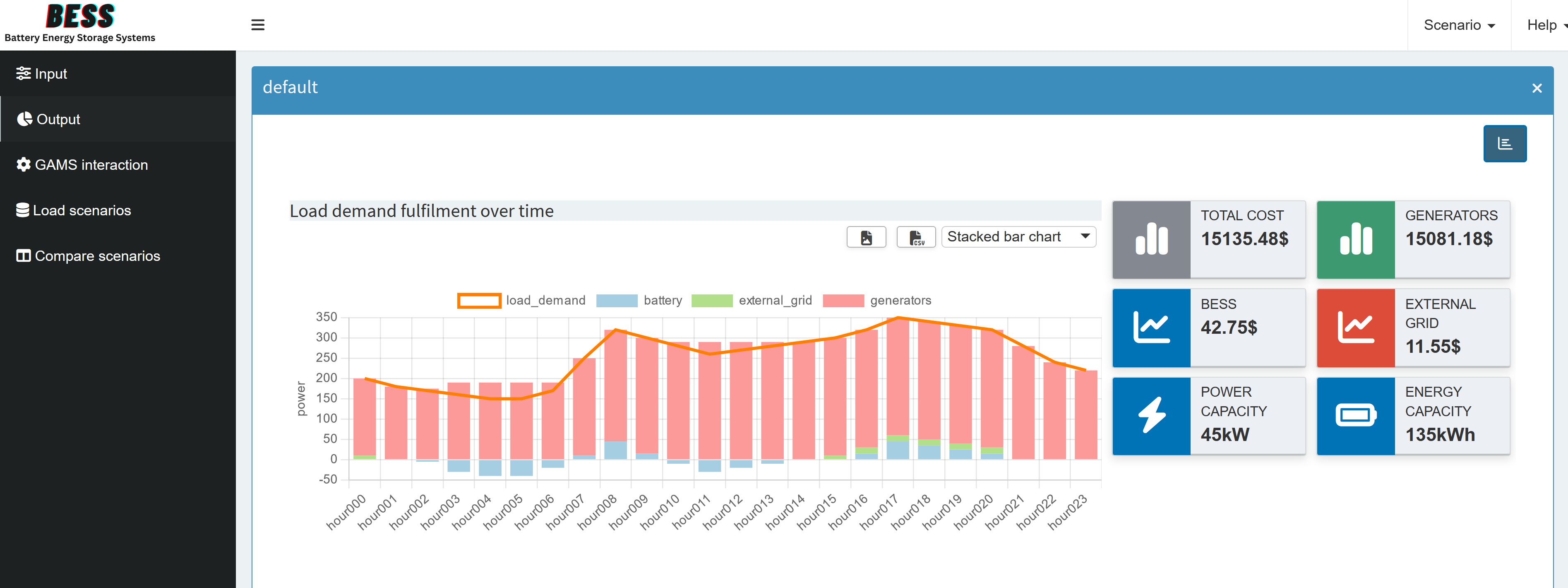
We won’t cover every possibility here because we looked at the Pivot tool in detail earlier. However, let’s check out a small example using value boxes for our output. First, we select a scenario (currently, only the default scenario is available). Then we pick the GAMS symbol _scalars_out: Output Scalars and choose the charting type Valuebox for scalar values. From there, we can specify the order of the value boxes, their colors, and units. After clicking Save, we launch the application in Base Mode and see something like this:

We can also add the views we set up in the previous section.
If you are looking for something specific, check out the documentation , which provides an extensive guide to all available plot types.
Each change we make in the Configuration Mode is automatically saved to <model_name>.json. In the documentation you will find the corresponding json snippets you would need to add, but don’t worry, this is exactly what the Configuration Mode does when you save a graph!
Finally, in the Charting Type drop down menu you will also find the Custom Renderer option, which we will talk about in the next part.
Scenario analysis
MIRO has several build-in scenario comparison modes that allow to compare the input and/or output data of different model runs. While most compare modes are available out of the box, you can enable a dashboard for scenario data comparison with some app-specific configuration. We will introduce the dashboard compare in the next section. The process for setting this up will be explained after the regular dashboard renderer is introduced .
Database management
Finally the Configuration Mode also allows you to backup, remove or restore a database .
Since all these configurations do not take much time, this could be your first draft for your management. Now they can get an idea of what the final product might look like, and you can go deeper and add any further customizations you need. How to do this is explained in the next part.
Dashboard
You may have already noticed the Dashboard option in the Graphs section of the MIRO documentation. If we have several saved views - perhaps some combined with Key Performance Indicators (KPIs) - a dashboard can provide an organized overview of our application output.
Creating a dashboard is not directly possible from Configuration Mode. Instead, we need to edit our <model_name>.json file. To add a dashboard, we will follow the explanation in the documentation . Here we will only discuss the parts we use, for more information check the documentation.
Before we modify the JSON file, we need to decide how we want the final dashboard to look. Specifically, we should choose:
- Value Boxes (Tiles): Which scalar values we want to highlight, and whether they serve as KPIs.
- Associated Views: Which views will be linked to each value box. Most likely, we can reuse the views we created earlier.
We find our <model_name>.json file in the conf_ <model_name> directory. Here, we look for the dataRendering key - or define it if it doesn’t exist (it won’t, if you followed this tutorial). We need to pick an output symbol to serve as our main parameter, but the choice isn’t critical - we can add other symbols later as needed. We just can’t have another renderer for this specific symbol if we choose to have more output tabs than just the dashboard.
For this example, we’ll choose "_scalarsve_out". This symbol contains all scalar output values of variables and equations. Because we probably won’t create an individual renderer for them, it’s a convenient symbol choice for our dashboard.
Getting more specific, in bess.json we now need to configure three things:
- The value boxes and whether they should display a scalar value (KPI).
- Which data view corresponds to which value box and which charts/tables it will contain.
- The individual charts/tables.
Here’s the basic layout of our dashboard configuration for the symbol "_scalarsve_out":
{
  "dataRendering": {
    "_scalarsve_out": {
      "outType": "dashboard",
      "additionalData": [],
      "options": {
        "valueBoxesTitle": "",
        "valueBoxes": {
            ...
        },
        "dataViews": {
            ...
        },
        "dataViewsConfig": {
            ...
        }
      }
    }
  },
}
If we already had other renderers, they would appear under dataRendering as well, we’ll add ours in the next section.
To keep the code snippets concise, we will only look at the options we changed and have the full json at the end.
Adding Additional Data
Usually, we don’t immediately know every dataset we need. In this tutorial, however, we already plan to use "report_output", "gen_power", "battery_power" and "external_grid_power" since we already have an idea of which views we want to display. But of course you can add or remove symbols at any time. Further we will add the input symbol "generator_specifications" to easily check if the generator characteristic are fulfilled. All needed symbols are added to "additionalData":
"additionalData": ["report_output", "gen_power", "battery_power", "external_grid_power", "generator_specifications"]
Value Boxes
In the options we can first add a title for the value boxes.
"valueBoxesTitle": "Summary indicators",
Let’s create six value boxes in total, but we’ll only discuss the first two in detail. Try adding the others for the ids: "battery_power", "external_grid_power", "battery_delivery_rate" and "battery_storage". Each value box needs:
- A unique id (to link it to a corresponding data view, if any).
- An optional scalar parameter as KPI. If you don’t have a matching KPI, but still want to have the view in the dashboard, just set it to
null. - Style parameters (see the value box documentation for more information).
"valueBoxes": {
    "color": ["black", "olive"],
    "decimals": [2, 2],
    "icon": ["chart-simple", "chart-simple"],
    "id": ["total_cost", "gen_power"],
    "noColor": [true, true],
    "postfix": ["$", "$"],
    "prefix": ["", ""],
    "redPositive": [false, false],
    "title": ["Total Cost", "Generators"],
    "valueScalar": ["total_cost", "total_cost_gen"]
}
Click to see the code for all six boxes
"valueBoxes": {
    "color": ["black", "olive", "blue", "red", "blue", "blue"],
    "decimals": [2, 2, 2, 2, 2, 2],
    "icon": ["chart-simple", "chart-simple", "chart-line", "chart-line", "bolt", "battery-full"],
    "id": ["total_cost", "gen_power", "battery_power", "external_grid_power", "battery_delivery_rate", "battery_storage"],
    "noColor": [true, true, true, true, true, true],
    "postfix": [ "$", "$", "$", "$", "kW", "kWh"],
    "prefix": ["", "", "", "", "",  ""],
    "redPositive": [ false, false, false, false, false, false],
    "title": ["Total Cost", "Generators", "BESS", "External Grid", "Power Capacity", "Energy Capacity"],
    "valueScalar": ["total_cost", "total_cost_gen", "total_cost_battery", "total_cost_extern", "battery_delivery_rate", "battery_storage"]
}
Data Views
Next, under "dataViews", we define which charts or tables belong to each value box. A data view is displayed when the corresponding value box is clicked on in the dashboard. Multiple charts and tables can be displayed. We only connect data views to the first four value boxes, leaving the last two without any dedicated view. This is done by simply not specifying a data view for those id’s.
The key of a data view (e.g. "battery_power") must match the id of a value box in "valueBoxes". We start each data view with the id from the corresponding value box, then we assign a list of objects to it. Each object within the list has a key (e.g., "BatteryTimeline") that references a chart or table we will define next in "dataViewsConfig", and as value we assign the optional title that will be displayed above the view in the dashboard. If you want to have more than one chart/table in a view, just add a second element to the object, as is done for "gen_power".
"dataViews": {
    "battery_power": [
        {"BatteryTimeline": "Charge/Discharge of the BESS"}
    ],
    "external_grid_power": [
        {"ExternalTimeline": "Power taken from the external grid"}
    ],
    "gen_power": [
        {"GeneratorTimeline": "Generators Timeline"},
        {"GeneratorSpec": ""}
    ],
    "total_cost": [
        {"Balance": "Load demand fulfillment over time"}
    ]
}
Configuring Charts and Tables
The only thing left to do is to specify the actual charts/tables to be displayed. This is also explained in detail in the documentation . The easiest way to add charts/tables is:
- Create views in the application via the pivot tool.
- Save these views.
- Download the JSON configuration for the views (via Scenario (top right corner of the application) -> Edit metadata -> View).
- Copy the JSON configuration to the
"dataViewsConfig"section. Most of the configuration can be copied directly. We just need to change the way we define which symbol the view is based on. It is no longer defined outside, but we will add"data: "report_output"to specify the symbol, otherwise MIRO will base the view on"_scalarsve_out"since that is the variable the renderer is based on.
{
-  "report_output": {
    "Balance": {
      ...
+     "data": "report_output",
      ...
    }
-  }
}
The complete configuration in "dataViewsConfig" looks like this:
Click to see the code for all four views
"dataViewsConfig": {
  "Balance": {
      "aggregationFunction": "sum",
      "chartOptions": {
          "multiChartOptions": {
              "multiChartRenderer": "line",
              "multiChartStepPlot": false,
              "showMultiChartDataMarkers": false,
              "stackMultiChartSeries": "no"
          },
          "multiChartSeries": "load_demand",
          "showXGrid": true,
          "showYGrid": true,
          "singleStack": false,
          "yLogScale": false,
          "yTitle": "power"
      },
      "cols": {
          "power_output_header": null
      },
      "data": "report_output",
      "domainFilter": {
          "default": null
      },
      "pivotRenderer": "stackedbar",
      "rows": "j",
      "tableSummarySettings": {
          "colSummaryFunction": "sum",
          "enabled": false,
          "rowSummaryFunction": "sum"
      }
  },
  "BatteryTimeline": {
      "aggregationFunction": "sum",
      "chartOptions": {
          "showDataMarkers": true,
          "showXGrid": true,
          "showYGrid": true,
          "stepPlot": false,
          "yLogScale": false,
          "yTitle": "power"
      },
      "data": "battery_power",
      "domainFilter": {
          "default": null
      },
      "filter": {
          "Hdr": "level"
      },
      "pivotRenderer": "line",
      "rows": "j",
      "tableSummarySettings": {
          "colEnabled": false,
          "colSummaryFunction": "sum",
          "rowEnabled": false,
          "rowSummaryFunction": "sum"
      }
  },
  "ExternalTimeline": {
      "aggregationFunction": "sum",
      "chartOptions": {
          "showDataMarkers": true,
          "showXGrid": true,
          "showYGrid": true,
          "stepPlot": false,
          "yLogScale": false,
          "yTitle": "power"
      },
      "data": "external_grid_power",
      "domainFilter": {
          "default": null
      },
      "filter": {
          "Hdr": "level"
      },
      "pivotRenderer": "line",
      "rows": "j",
      "tableSummarySettings": {
          "colEnabled": false,
          "colSummaryFunction": "sum",
          "rowEnabled": false,
          "rowSummaryFunction": "sum"
      }
  },
  "GeneratorSpec": {
    "aggregationFunction": "sum",
    "pivotRenderer": "table",
    "domainFilter": {
        "default": null
    },
    "tableSummarySettings": {
        "rowEnabled": false,
        "rowSummaryFunction": "sum",
        "colEnabled": false,
        "colSummaryFunction": "sum"
    },
    "data": "generator_specifications",
    "rows":"i",
    "cols": {"Hdr": null}
  },
  "GeneratorTimeline": {
    "aggregationFunction": "sum",
    "chartOptions": {
        "showXGrid": true,
        "showYGrid": true,
        "singleStack": false,
        "yLogScale": false,
        "yTitle": "power"
    },
    "cols": {
        "i": null
    },
    "data": "gen_power",
    "domainFilter": {
        "default": null
    },
    "filter": {
        "Hdr": "level"
    },
    "pivotRenderer": "stackedbar",
    "rows": "j",
    "tableSummarySettings": {
        "colEnabled": false,
        "colSummaryFunction": "sum",
        "rowEnabled": false,
        "rowSummaryFunction": "sum"
    }
  }
}
Finally, we end up with this dashboard:

Now that we’ve combined multiple outputs into a single dashboard, it makes sense to hide the tabs for the individual output symbols and rename the dashboard tab for clarity (in the config mode). Just a heads up, you should keep "report_output", we will add a custom renderer for it in the next part.
It is also possible to add custom code to the dashboard. However, since this requires a bit more effort and you need to know how to create a custom renderer in the first place, we will leave this for the next part.
Dashboard Comparison
As mentioned before, MIRO provides three built-in scenario comparison modes, accessible under the Compare scenarios tab. The Split view comparison mode displays two scenarios side by side, showing all configured renderers for both input and output symbols - this includes the previously created dashboard. As an example, we will compare our default setting with a scenario where we set the cost of BESS to zero:

If you need to compare more than two scenarios, you can use the Tab view comparison mode, which organizes any number of scenarios (and their renderers) into separate tabs. Finally, the Pivot view comparison mode merges all scenario data into one pivot table for each symbol. It is the same pivot tool with its many possibilities that we have already used so much.
In addition to these ready-to-use comparison modes and custom compare modules , there is another one, dashboard comparison mode , which must be configured specifically for the app before it can be used. We will do this in the following.
The configuration of our regular dashboard renderer can be largely adopted, we just need to make some small adjustments:
-
We just configured the dashboard in the
dataRenderingsection of the <model_name>.json file. For scenario comparison, the configuration should be placed in a separate section calledcompareModules. -
While a regular dashboard configuration applies to a single symbol, a scenario comparison is symbol-unspecific. This means that the scenario comparison has access to all input and output symbol data by default. As a result, you don’t need to manually list each symbol under
additionalData. This also means that the symbol data to be used for a chart/table must be specified in each view in"dataViewsConfig"("data"property). However, if you have followed the tutorial, this was already done for all views. -
Instead of the
"outType"in the dashboard configuration, here we have a"type": "dashboard". -
We also need to assign a
labelthat will be displayed when the scenario comparison mode is selected. This label appears next to the options Split view, Tab view and Pivot view.
{
    "dataRendering": {
      "<lowercase_symbolname>": {
-       "outType": "dashboard",
-       "additionalData": [],
        "options": {
          "valueBoxesTitle": "",
          "valueBoxes": {
              ...
          },
          "dataViews": {
              ...
          },
          "dataViewsConfig": {
              ...
          }
        }
      }
    },
    "compareModules": [
      {
+       "type": "dashboard",
+       "label": "",
        "options": {
          "valueBoxesTitle": "",
          "valueBoxes": {
              ...
          },
          "dataViews": {
              ...
          },
          "dataViewsConfig": {
              ...
          }
        }
      }
    ]
  }
While we can copy "valueBoxes" and "dataViews" directly, we need to take a closer look at "dataViewsConfig"! As mentioned above, we need to specify what "data" the view is based on. Also, your data displayed in tables and graphs now has an additional dimension, the scenario dimension, where the scenarios to be compared are identified by name. This additional "_scenName" dimension must be added in the views under "dataViewsConfig". If you put that dimension into the "cols" section and do not want to pre-select a scenario (but show all selected scenarios instead), leave the value at null.
"dataViewsConfig": {
  "SomeView" :{
    ...
    "cols": {
      "_scenName": null
    },
    ...
  }
}
The additional scenario dimension also changes the appearance of the graphs. Some visualizations that were suitable for normal output may no longer be suitable for displaying multiple scenarios. In such cases, the view configuration (distribution of dimensions in rows/cols/aggregation, etc.) can be adjusted as needed. The Pivot view comparison mode can help prepare the views, just as we prepared the views for the dashboard.
In the dashboard, we used stacked bar charts. If you start Compare scenarios in the Pivot view for the "report_output" symbol, it will look like this:

As you can see, the values for both scenarios are stacked on top of each other, so it’s no longer easy to see if the load is fulfilled. Comparing the scenarios becomes difficult. To fix this, click the  icon to add a new view (or the edit button to edit an existing one). In the view settings dialog that opens, find “Group stacks by dimension” and add the scenario dimension. This will group the stacked bars by scenario.
We can also adjust the coloring so that the value for, e.g., "generators", is the same across all scenarios. The “Series Styling” tab in the view menu allows to assign custom colors to individual series. So you could assign the same color to each series containing "generators". Keep in mind that this approach is not generic as the scenario name is part of the dimensions. A generic, scenario-independent approach is to define a color pattern for all series that contain "generators". This can be done in the JSON file itself (read more about this here
).
The "Balance" view could look like this:
"Balance": {
  "aggregationFunction": "sum",
  "chartOptions": {
    "customChartColors": {
      "battery": [
        "#a6cee3",
        "#558FA8"
      ],
      "external_grid": [
        "#b2df8a",
        "#699C26"
      ],
      "generators": [
        "#fb9a99",
        "#D64A47"
      ],
      "load_demand": [
        "#fdbf6f",
        "#B77E06"
      ]
    },
    "groupDimension": "_scenName",
    "multiChartOptions": {
      "multiChartRenderer": "line",
      "multiChartStepPlot": false,
      "showMultiChartDataMarkers": false,
      "stackMultiChartSeries": "no"
    },
    "multiChartSeries": "load_demand",
    "showXGrid": true,
    "showYGrid": true,
    "singleStack": false,
    "yLogScale": false,
    "yTitle": "power"
  },
  "cols": {
    "_scenName": null,
    "power_output_header": null
  },
  "data": "report_output",
  "domainFilter": {
    "default": null
  },
  "pivotRenderer": "stackedbar",
  "rows": "j",
  "tableSummarySettings": {
    "colSummaryFunction": "sum",
    "enabled": false,
    "rowSummaryFunction": "sum"
  },
  "userFilter": "_scenName"
}
The scenario comparison dashboard is ready! It now displays the data of all selected scenarios in the dashboard we are familiar with. The value boxes are empty by default. You can use a drop down menu above them to select a scenario from which the corresponding values are displayed. Now you can see directly how the costs of the BESS affect the use of the generators etc.

Key Takeaways
- Simple Customization: Change chart defaults, rename symbols, and customize input widgets directly from the Configuration mode.
- Presentation-Ready: Save preferred views so end users see the best visualizations right away.
- Comprehensive Overview: Although configuring the dashboard requires some effort, it provides a unified view of all scenarios.
- Easy Comparison: Quickly compare multiple scenarios within a single dashboard for better insights.
After exploring all the out-of-the-box customizations for our application, the next step is to dive into the custom code extensions that MIRO offers. This will be the focus of our third and final part, where we will demonstrate how to write custom renderers, widgets, and importer/exporter functions in R. Don’t worry if you’ve never worked with R before-we’ll introduce you to all the necessary R functions.